Art Nouveau cont.

Continuing in the subject of Art Nouveau, a very prominent distinction in the works developed can be seen depending on their place of origin.

For example, in France, it began as an effort to break away from the traditional historical styles and to give decorative artists equal status with painters and sculptors that were so highly regarded at the time. French artists had the opportunity to see works in the new styles by furniture makers, jewelers , and glass designers. 

Whereas for example, in Germany, Art Nouveau became commonly known through an artistic journal, published out of Munich that appraised and upheld the new artistic movement. The magazine was pivotal in promoting the style throughout Germany. As a result, its name was adopted using the most common German-language term for the style: Jugendstil (“youth style”). Although in Germany, during the early 20th century, the style was applied primarily to only two-dimensional examples of graphic arts, influenced by German magazines, it later became applied to more general representations of Art Nouveau within visual arts in Germany.

Observing how a style can differ and develop through the handling and teaching of the society it resides within is very important because of how the same principles come into play with todays society. The understanding of how through that social connection we motivate the future creation of art and design that is to come.


JUGENDSTIL

In the continuation of the Art Nouveau discussion I believe that it is important to focus on the fact that every art piece by each artist has something unique. So rather than it being a part a uniform specific look, artists had their own way in the movement. I believe that, that is the essence of a movement. Where there can be more than one path but they are still under the same umbrella. Whether the designs are with flowing hair and beautiful flourished clothing, or straight, long hair, with stiff lines and crisp edges, it all fell under the same umbrella of Art Nouveau. The Secession furniture was a very “unique” for lack of better word. It seemed to be more for ornament than functionality. All of them seemed more design centered. I believe that some of the colors that were used, weren’t considering ambiance as a factor in the setting. For example, the fire place with the roses was kind of tacky, when it came to the color. And based on the way that it was presented, I don’t believe that it was intended to be used for actual fires. Either way, every artist had their style which I highly respect.

Art Nouveau Difference

This weeks art nouveau has subtle curves compared to last weeks sinuous curved lines for an example of difference. But I always have thought that where the style of art is it develops to fit that region because I think every region has its own certain style that sets it apart whether it may be something huge to something small. It varies but I still believe that to be true. I think life would be boring without some uniqueness especially in art. Honestly I liked last weeks art nouveau more though it’s got kind of a unique feel to it that’s not too complex. But I do appreciate some of the stuff in this weeks art nouveau it just seems kind of complex in certain aspects for me. A lot of this weeks art nouveau just kind of seems flat to me if that makes sense in certain pieces. I am not saying this is what I see in every part of this weeks. The different regions is one of the main contributing factors of the differences in this weeks and last weeks art nouveau. I think it develops certain styles that show in certain regions. This weeks art nouveau had some cool pieces but last weeks seemed to intrigue me more.

Art Nouveau 2.0

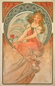
The art nouveau that we learned about last week differs from the art nouveau that we learned about this week. The art we are learning about this week. The Four style is based off of the glasgow style which is a A syncretistic blend of influences celtic revival, the arts and crafts movement and japonisme. They Four are from Scotland and that played an important part influencing their art work. Mostly because it had a celtic feel to it. The key differences between Mucha and The Four is the color and the presentation of the subject matter. In the Four’s version the colors are not as vibrant and more in the celtic form and the figures are elongated. Mucha’s work is vibrant the woman have flowing hair and they represent beauty and sexuality. They both use some type of nature aspect included. Out of the ones we have learned about I think that
i prefer the previous weeks over this weeks, just because they have more color than the others.

Frances_Macdonald,_Sleeping_Princess 2

download 2

Art Nouveau take 2

The previous weeks Art Nouveau was colorful and swirly. This weeks is very dark and dindgy. Culture was a huge part of what art they produced as well as the world around them. The events that were taking place. The stylistic keys in this weeks Art Nouveau was the color mostly. The content too but the colors represent what they are feeling about that time. I like darker art it says more emotion about the time.

Art Nouveau Part Two

This part of Art Noveaus has some darker pieces, pictures of people and furniture, and some ads for companies that seem dark. Personally, I didn’t like some of them because some of them were dark. Yes, I think that the country’s culture a major factor on how the art nouveau was developed. Some of the pictures were photos taken of furniture and some parts of rooms. Some of the pictures seem dark like the one of the lady dancing with the devil. Some of the females were drawn differently. I believe it’s because these artists have different views than last week’s artists did. The way they draw and paint is a bit darker than last week’s artists. Darkness is one thing I don’t like. I don’t know what the artists are trying to do but whatever they are doing, I don’t like it. I prefer last week’s artists than this weeks. It is because that some of these pictures are dark. Last week had some light paintings and I liked them a lot better than this weeks paintings.

Art New View (Cont.)

Art Nouveau is a topic I really can’t speak much about. However, what I thought about this week’s art nouveau that differs from last week’s is that this week’s art was more culture based if that makes any sense. For example, Katie showed us two different pictures of the art nouveau category and wanted us to see which country we could relate it to. Taking that into account, it seemed like more of a cultural reference to me. It was pointed to me that each country had a different style to their paintings.

I do believe that a country’s culture does play a role in how their art nouveau develops. France and/or England’s art nouveau pictures I saw were mainly centered around women and the nature surrounding them. As well as Scotland tends to use more geometric looks to the art style. From what I can gather, the artists this week may have the same amount if not more influence than last week’s as well as the art styles established in that time, such as Werkstatte Style. If I had to decide which week’s art nouveau picture were better, I would say last week’s images for the sole fact that they had less disturbing images.

Art Nouveau 2: Simple is Better

Last week, we covered Art Nouveau that was very asymmetrical, nature in form (grassy, floral, vines, butterflies, insects). It was also Japanese inspired as well. This week however, we are covering art in Germany, Austria and Scotland, which is very different. It’s not drastically different, but you can tell they had their own cultural differences. A lot of this art shifted during the industrial revolution and everything was so mundane and mechanical. In Scotland, a little town (Glasgow) had a huge urban growth. I definitely think the artists were influenced by the French, but they made it their own. This time, it’s a little more modern. Take for instance Frances Macdonald, Margaret Macdonald and Herbert MacNair’s pieces (or the Four), compared to last week’s Alphonase Mucha’s. As I was saying last week, you will find Mucha’s work has classical women, Japanese patterns, very romanticized and has nature elements. This week, you can see “The Four’s” poster designs are similar. Their work though is very symmetrical and geometric. It still has the same organic feel but in it’s own separate boxes. Same with the typography, it’s very clean, organized and polished.

thearts mackintosh


So, if I had to pick which week I liked best, I would definitely choose this week’s Art Nouveau. I love geometric forms. Especially the architecture that was covered in this chapter. I prefer the mechanical look of buildings compared to the nature/organic and flow-y lines that they used in architecture. That doesn’t mean I do not like nature though. It just think the aesthetic is visually pleasing. Same with the bold colors, block type and angular lines. I love the restricted and tight look. It’s simpler, more uniform and symmetrical.


Embracing the Grotesque

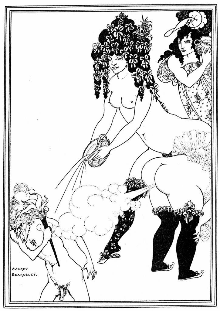
This is the piece I examined last week:

Humorous piece by Beardsley

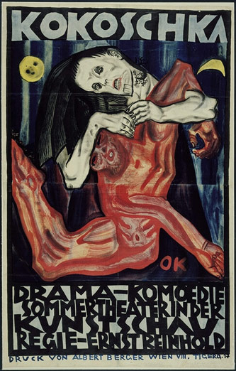
And this is the piece I’m looking at this week:

Example of Austrian Expressionism

Both pieces are grotesque in their own way with the first piece being more playful and fun (to me, anyways) while the second piece lacks that light-hearted feel and strikes me as disturbing in a dark sort of way. The second piece as a part of the Austrian Expressionist Movement focuses on expressing violent emotions to get an emotional response from the viewer. A lot of the work was in response to war and death. I definitely think the culture affected the second piece of work as I mentioned previously this was produced in response to the violence of the war and people were hurting and suffering mentally because of it, and so having the freedom to express that resulted in dark imagery and twisted forms. Not all work was as dark as this though.

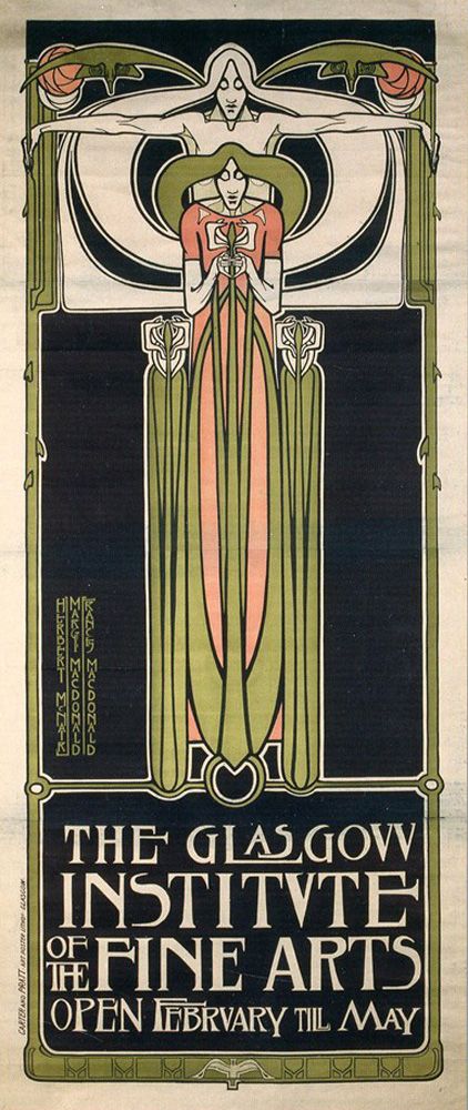
Glashow Promotional Piece

This piece isn’t what I’d consider grotesque, but rather simple and starting to feel more modern. More attention is given to font and its placement. I am really liking the vertical type that’s set next to the main image. I’m still seeing the solid background color that we saw last week and also the elongated human form. This work is still being influenced by Japan’s culture and style. One final piece that I found important is this one, which is the first time we are seeing a unified attempt at branding a company:

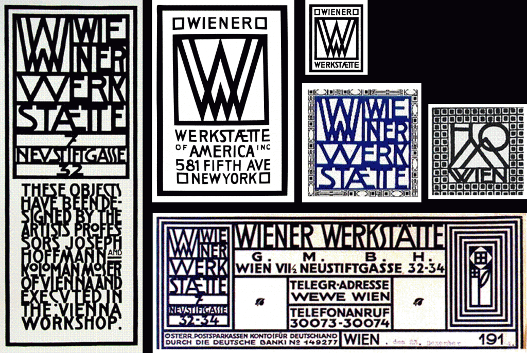
Early Branding

Early Branding

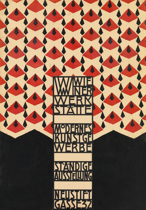
Werkstatte started exploring logo and corporate branding that reflected their work. We see more unity and attention paid to typeface and font choice/setting versus what we saw last week. They also seem to be keeping their branding in mind when creating promotional materials such as this one:

Promotional Work by Josef Hoffmann for Wiener Werkstatte

Promotional Work by Josef Hoffmann for Wiener Werkstatte

We are still seeing bold colors, but there is a lot of use of abstract shapes. I do prefer this week’s Art Nuevo over last weeks because it’s starting to take on a more modern, clean, and less overwhelming aesthetic and artists and designers seem to be exploring abstract shapes, type, and word placement instead of trying to create beautiful imagery. There also seems to be a break from looking to nature for inspiration, but looking to those things that humans are making such a buildings, structures, and machines. Those types of things inspire me as well.

Different Look on Art Nouveau

This week in class we looked at art nouveau in Germany, Scotland and Austria. The art nouveau from this week had a darker color and more symmetrical. Compared to last week’s art nouveau where the colors were a little more vibrant and the shapes and forms where organic and had a variety of curved lines. Where this week’s art nouveau has a more muted plate and more geometric shapes. Last week art nouveau had more of a Japanese feel. Germany, Scotland and Austria focused on creating new styles with no historical influences. Art nouveau styles in Germany and Austria were more avant garde where in Austrian, expressionism focused on the artist’s emotions more than anything else.

A liked last week’s art nouveau compared to this weeks. With France the British and the United States, all played with Japanese elements and parts of nature with were big parts for the art nouveau. To me last week art nouveau was more pleasing to look at then the German Scotland and Austria’s art nouveau. I loved the flower elements and how the France and English styles played with the idea of beauty women, the flowing gowns, and the hair in the wind aspect where they were surrounded by nature.

Skip to toolbar