So with the previous lecture, I did not see many differences at all in the different Nouveau styles. They all had dramatic hair, clothes that would take up the entire page, big letters for whatever the purpose of the image was, and varying either monotone color tones or dramatic color. To me, I didn’t see a difference at all. What I liked is how you can tell what pieces were inspired by the Asian cultures, but other than that I didn’t really see anything that piqued my interest, or anything different. Possibly in some pieces things were more simplistic than others, but there were images that displayed an extraordinary amount of detail. I can definitely say that I prefer last weeks examples of Art Nouveau than the most recent week. Mucha is still my all time favorite Art Nouveau artist, as his work still inspires me to create whenever I look at his art. Overall, what I could tell is that compared to before, things were put more in a simplistic style other than putting in more detail their work, which is also a characteristic in society today. People switch to simpler designs for companies constantly as well, so there’s no surprise that we see history repeating itself as time goes on.
Category Archives: Week 6
Art NewVow Too
This week’s Art Nouveau differed compared to the last. In the prior week, the colors seemed much fuller in color and usually had bright color added into their designs. The art usually consisted of women and celebrating them. The artwork usually was also asymmetrical in composition and had incredibly detailed backgrounds. They usually had “flowing” lines with lots of movement.
This week, the color palette for the artwork was usually darker or more diluted compared to last weeks which was full in color. Instead of celebrating women, there were some figures that were hard to differentiate. Some art seemed more grotesque and did not really celebrate anything. It didn’t give off the same “happy” feel as the prior week attempted to do. Because the art had a more symmetrical approach, the final result ended up looking more geometrical in shape.
It would make sense that the two weeks differed from each other, because as listed above, the artwork did have distinct differences from one another. I prefer the light colored and curvy, long lines from the first week compared to the geometrical approach; however, I am not a fan of the more grotesque images from the second week as they did not appeal to me.
Art Nouveau vs. Art Nouveau
In my previous post I talked a little about what some countries were creating at this time and how they were very different. The first week’s art was based from England, France, and the United States. This art work was simple in form. While the patterns were inspired by British Flora and Fauna. To me many of the patters were very crowded and looked chaotic, like there was not enough room to fit everything they wanted so the compacted it all into one little spot. In these patterns they use bold and strong colors. These countries were also strongly influenced by the Japanese. Some like the United States were influenced more than others. Another thing I realized while looking at the United states art work during this period was the influence the creation of the bike and the industrial revolution.
The second portion of the Art Nouveau era that were concentrated on were countries like Spain, Germany and Switzerland. Many of German’s images often used unique typefaces worked harmoniously with the images. Meaning the type is worked into the image and is does not just lay on top of the image or where ever there is an “empty” space. In my opinion this is the first images were the type is starting to be more thought out on the placement, size and font.
Differing Art Nouveau
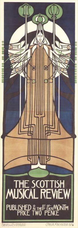
Art Nouveau in places like Scotland, Austria, and Germany were very different from places like France, America, and Britain. Unlike France, America, and Britain, Germany Austria and Scotland did not use many curved lines. Everything they produced seemed to be very symmetrical in nature and the likes were very angular. These differences defined their style. This was also a style that started to consider type and the way it looked in relation to the illustration. Everything produced was also elongated and distorted and stretched. The colors used in these places were also very uniform. they used basic colors like red and blue and let them pop against a flat, solid background. I do think that these country’s culture had a huge factor in they way they developed art. These country’s were expieriencing different things then last weeks and being that they were expieriencing different things, they developed their own styles that best fit what was happening to them at the time. While I personally enjoy that the works were symmetric, I still enjoyed last weeks works more. I like the realisticness of them more. I am not a huge fan of the elongated figures and the bold blocky colors. However, that being said I do still enjoy looking at these works. I just don’t think I would go out of my way to see them because they don’t appeal to me stylistically. Some of the key differences were also the angular lines. That is something that I don’t mind because I am more of a fan of geometric lines but that being said I still like to see things that are realistic.
Art Nouveau Part 2
This week, we covered Art Nouveau in Scotland, Germany, and Austria. The biggest difference that stood out to me was that the Art Nouveau from this week was much more geometric and simplistic. They show hints of Japanese influence in the way the faces are drawn, especially in the Scottish works. There isn’t as much of a focus on nature though. I don’t think that the countries from this week were not as affected by the culture. Austria didn’t have one set style, which points to the fact that there wasn’t really a common influence. The Scottish Art Nouveau was the creation of a group of four people that worked together, so the Scottish style was simply the byproduct of this group’s style.

The left one is by Mucha and the right one is by Macintosh. Both portray a female figure, but in Macintosh’s, we see more symmetry and geometry, whereas Mucha’s is more organic and has more flow. With Mucha’s work, we definitely see the Rococo influence, while Macintosh’s shows Japanese influence in the face of the figure more than anything.
I prefer the Art Nouveau of last week over this week’s. I especially like Mucha’s work. Personally, my style is more simple, like this week’s artists, but I like the more detailed and ornate works of last week. I also like the organic nature of the art from last week, I find it much more appealing to the eye than very blocky geometric works.
Art Nouveau Continued
After looking at the images from last week’s study of Art Nouveau, you can see from this week’s images that Art Nouveau continued to evolve and take different patterns in design. This week, we saw more Geometric, elongated, and darker pigmented images. The week before we saw images of romantic women in light pastel colors with whimsical borders. I feel the geometric methods of design we learned this week were very effective. I feel the designs we saw this week has a much more modern approach, especially compared to any other Art Nouveau images we saw last week. These images I think would work today in modern advertisements and commercials a lot better than last week’s Art Nouveau images. Geometric design work is very common to see around the world today, which is why I feel the new images we saw this week would work just as well today as other modern designs. Also, lots of figure illustrators like to use an elongated looks as of today. Below, I included an Art Nouveau image of figures (left), and a modern image (right) just to show you the comparison. The artist that created the image on the right is Hayden Williams, fashion illustrator.

Art Nouveau from Germany, Scotland, and Austria
The artwork from Art Nouveau that were reviewed this week is different than the Art Nouveau from last week. The works from the previous week were from England, France, and the United States, compared to the Art Nouveau we looked at this week from Germany, Scotland and Austria. The Art Nouveau we looked at this week was more symmetrical and seemed to be more abstract in comparison to those from England, France, and the United States. The colors are darker, and there is less variety in colors, compared to the Art Nouveau from last week. Last week, a lot of the art had a lot of curved lines and organic shapes, whereas with works from this week, there is a lot more geometric shapes and symmetry. There was a lot more ornamentation in the works from the previous week, the art from this week is much simpler in design. The different cultures definitely influence the art work. I personally am not terribly fond of the art from either week, although I can appreciate their differences and creativity. I find myself drawn to colors, and I didn’t like the color schemes that a lot of the works from that time used. Looking at the different art work, it is interesting to see the differences and similarities and how design once was.
True Nouveau: Continued
Last week’s Art Nouveau work was different from this week’s in the fact that it was more curvaceous and representative of the natural form. For example, many posters had an asymmetrical depiction of women with flowing hair, halos, and very detailed backgrounds. In this week’s examples, however, most of the work is symmetrical and less ornate. Also, the colors are darker and the people depicted are not bright and dreamy like those seen in last week’s Art Nouveau examples.


I believe that yes, the different countries’ cultures influenced the ways in which their works differ from that of other countries. Besides the obvious differences in the way people were portrayed (i.e. the posters with Japanese influences as opposed to other Art Nouveau posters), variations existed stylistically in many forms. France favored realistic lines whereas in countries like Scotland and the Netherlands, a more geometric approach was popular. Furthermore, countries like Belgium utilized neither type of line. They developed their own popular style known as “whiplash”. Although both last week’s and this week’s art is categorized under the umbrella of Art Nouveau, each was influenced separately by a particular country’s culture. To be quite honest, I can appreciate both weeks’ art because they are unique and captivating but for different reasons. I don’t believe one is better than the other; I have always been drawn to detailed geometric patterns, but I also really enjoy the flow and intricacy of last week’s Art Nouveau.
Different Art Nouveau’s
While looking at the two weeks together I noticed quite a difference between some of the pieces. In last weeks Art Nouveau’s examples it showed alot of dull color pallets, but alot of it was asymmetrical. Some of the pieces had nice borders around them with much detail. Along with the art work its self had alot of small detail put into the piece. But when looking at this week’s art nouveau I noticed that alot of it was Symmetrical and had dull-ish pallet’s also. In last week’s I also noticed that some of them were pretty grotesque compared to this weeks. This weeks I noticed that it was more dull and boring in the art work. I feel that the countrys culture did play a massive role in the Art Nouveau’s development there because each country has its own style and uniqueness to its pieces. A piece from japan would be very different from a piece to Germany. Japan’s would be more in a black ink color, or have alot of color and alot of detail compared to Germany’s art. The stylistic differences in the pices from last week and this week were that some was asymmetrical compared to symmetrical, also the color pallets were different because some were dull and then the others were bright. I feel these artists did have different influences than the previous week because they were in a different country area so they had different things going for them than the other countries of last week. I prefer last week’s art nouveau because it was more grotesque in the black and white images done that are japanese-looking style. 

Growth of Nouveau
This week’s Art Nouveau pieces differed from last week’s in a couple different ways. One of them being the symmetry; everything was very balanced as we saw right away from Scotland. Next we have the color palettes for the pieces. They were very toned down colors and not a wide range like we saw from Mucha. Also, there was very simplified figures and overall simplified pieces as opposed from last week were there was tons of details in each piece.


On the left we have two pieces done by Alphonse Mucha and on the right we have two pieces done by Charles Rennie Mackintosh. Already you can see a noticeable difference between the two of them. Let’s start with Mucha first. The first thing to come out at me with Mucha is the amount of colors there is; very nice balance between warm and cold tones along with shading and attention to detail on the females themselves. Next I noticed the borders surrounding the women to be just a pretty as they are along with the asymmetry of the piece as a whole. The women are centered in the middle but neither side of them is identical BUT that doesn’t mean the piece isn’t balanced- in fact it is very balanced.
Okay, let’s move on to Mackintosh. Right away the difference I notice is the colors. There is a small color palette for both pieces- only consisting of green, black, blue, brown, and white and a bit of pink- but other than that nothing. Next we see the borders surrounding the figures is VERY geometric and not as detailed as Mucha. Furthermore the whole piece of Mackintosh is very geometric. Symmetry is very obvious in these pieces and shows a more stiff and balanced piece as opposed to Mucha. The next thing I notice is there is not a lot of detail in the figures themselves. Very stylized and simplified women but yet- still just as beautiful. Also the figures anatomy seems to be longer; like someone stretched them out while Mucha’s figures are more on the anatomically correct.
Now that we have discussed how different the pieces are let’s point out the similarities they have. It is not much but it is still obvious that the two pieces by two artisits have some things in common being that they are both from the era of Art Nouveau. The big thing the pieces have in common is the connection to nature. Both pieces have flowers or some type of element connecting it with nature in some way. Obviously Mucha’s figures are surrounded AND holding flowers while Mackintosh’s figures are very subtle and have a few flowers surrounding them. Another thing the pieces have in common would be the fact that woman are the focus point; one is more detailed than the other but you can tell that it is still female. Both seem to have influences from similar things such as nature and women.
To pick which style I like more I would have to go with last week’s. Mucha’s style has always been one of my favorites and the amount of details not only Mucha had but the other artists make the pieces more pleasing to look at in my eyes. Not to mention all the colors and overwhelming influences from nature- I feel more connected with the Art Nouveau from England, France and the US more but I appreciate both styles very much so.