Saxton Campbell is a designer living in NY, NY, who I stumbled on randomly after setting up an account on Behance. I am drawn to him because he seems to have merged design + art + styling + fashion + photography in a minimal, clean, fresh, and eye-catching way that I would love to be able to learn how to do with my own work.

His work seems to be most influenced by the International design movement as it’s very pared down and has clean lines and clean type.
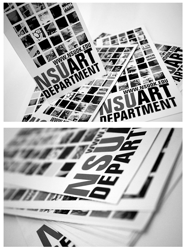

Here is an example of a brochure he worked on that made interesting use of grids and blocky text. Also, I am drawn to the absence of color and yet the design remains visually appealing. His work doesn’t all follow this minimal color usage but he does seem to like monochromatic color schemes. Here is a campaign he worked on to bring breast cancer screening awareness that incorporates his photography and design:


I find photography compelling because it breaks the fourth wall and alludes to breasts in a way that’s abstract and not sexual. The color also isn’t stereotypical pink, but a warm fleshy color that’s really appealing to me. I also like his sense of balance and layering of fonts. You can see more of Saxton’s work here: Saxton Campbell