Synthetic Cubism was my favorite from this weeks discussion because I enjoy trying to figure out what it is the artist is trying to say or design. There are tons of different textures in the artwork, bright colors, and they are mostly geometrical shapes. The geometrical shapes the artists used are making a object or person you may have to look a little longer at the piece to figure it out and thats what I love about this style. I love art that catches your eye and makes you stare at it a little longer to try and figure out what it is the artist is trying to say or even make. The influence Synthetic Cubism has on today’s graphic design style is with the statues or textures on a corporate identity package.
Category Archives: Week 8
Art Deco
Of the designs and styles spoken of throughout this semester in Graphic Design Survey, Art Deco is by far in part one of my most enjoyed styles to indulge within. Art Deco was so influential visually; being a style that combined elements of traditional craft practice with “Machine Age” imagery and materials. The style is often characterized by its rich color usage, bold geometric letter shaping and luxurious ornamentation.
This design style first appeared in France before World War I and began expanding internationally in the 1920s, 1930s and 1940s before losing its momentum after the results of World War II. It took its name, short for Arts Décoratifs, from a past but prominent art exposition held in Paris in 1925.
When Deco started after post-WWI events had ceased, it was in a period when rapid industrialization was transforming most of urban culture. One of the biggest attributes being an embrace of technology; this distinguishes Deco from the organic motifs favored by its predecessor in Art Nouveau.
During its time of most prominent existence, Art Deco was the representation of luxury, glamour, and faith in the social and technological progressing of our culture. It is because of these represented, as well as implemented, ideals in design that I have developed such a liking to the style and the way it’s conveyed.

Cubes
Cubism has it’s own kind of spin on art and I like that. The way that they stand for the crisp lines an geometric patterns are very interesting and thought provoking, considering that the patterns show an image that you need to find. I believe that Cubism was one of the essential steps towards breaking away from traditional art. I didn’t however like the synthetic cubism too much. It seemed a little bit too out there for me. The Calligrammes weren’t really interesting. I liked how they were starting to use type and consider how it works in space and whatnot, but I suppose that it was more centered around the meaning in the poem or art piece rather than the way that it looks. I found it interesting how it did sort of pave the way for people to use type to create and image, and that was overall an artistically revolutionary act on part of the artist. Orphism was beautiful, with the rich color palettes that were used, and the design choices. I really enjoyed the painting of the Eiffel Tower in the city. IT was really emphasizing the beauty of distorted architecture, that which was yet to be spoken of.
Art Deco Definitely Has It Going On
From all the art styles we covered this week, the one that spoke to me the most would definitely have to be the Art Deco movement from the 1920s. Some redeeming traits that stick out to me when it comes to Art Deco is its general refusal to mass-produce its wares and its use of simple and clean streamlined shapes. When I become a graphic designer or artist (whichever comes first), I am going to mainly produce art that is free of nonessential details and gets it point across clearly. So, of course, I favor these attributes, and chose this style.

Some other characteristics of Art Deco include unusually varied designs, objects that were made out of expensive materials, and an admiration for the modernistic designs of machines and machine-made objects. So, in short, they like their designs relatively simple and (for the most part) no mass-producing; it was easier to make things more beautiful if time and energy, along with an individualized approach, was used. You could spend 10 hours making a fancy silverware set, or you could mass produce 200 sets in 2 hours. It was quality over quantity, which I appreciate.
In terms of art and graphic design history, Art Deco was well known for the time period and branched into just about any type of art medium you can imagine. Crafts, fine art, interior design, furniture, textiles – the list could go on and on. The style was also prevalent during the birth and death of the “Roaring Twenties”, a period in time defined by economic prosperity and a strong defiance against Prohibition. People also rejected traditional moral standards.

‘When I was a child, I could draw like Raphael, but it took me a lifetime to learn to draw like a child ‘ – Pablo Picasso
For this week, I picked Cubism and decided to focus on Picasso. Picasso is quoted as having said, “When I was a child, I could draw like Raphael, but it took me a lifetime to learn to draw like a child.” The thing about Picasso is that many people forget that he was classically trained and incredibly talented, and could create realistic art. Cubism was his way of breaking free of classic training and trying something more freeing and creative. Here are examples of his classically drawn work:
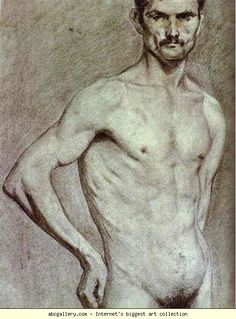
As you can see, Picasso understood the accurate proportions of the human body before choosing to experiment with new form of presenting the human figure. I chose to focus on Cubism because I think this style “gave permission” to other classically trained artists to experiment with breaking the rules.
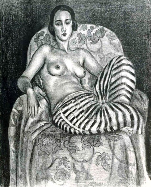
Typical characteristics of this style are objects are broken up into various shapes, objects are flattened and presented from multiple angles at the same time, oftentimes things are placed at odd and unpredictable angles to each other, and the between background and foreground are ambiguous. Here are examples from Picasso of him pushing the human form and breaking down traditional rules:
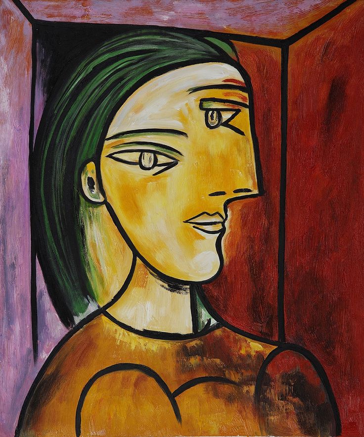

In the above two paintings, you can see all of the characteristics of Cubism — the angles of the fruit make it look like they cannot possibly stay on the table, and the bodies are distorted to the point where you don’t know what side or sides of the body you are looking at exactly. Proportions are quite off.
I do see cubism in today’s graphic design when it comes to illustration work. Here is example of using polygons in digital design to create a cubist-inspired portrait:
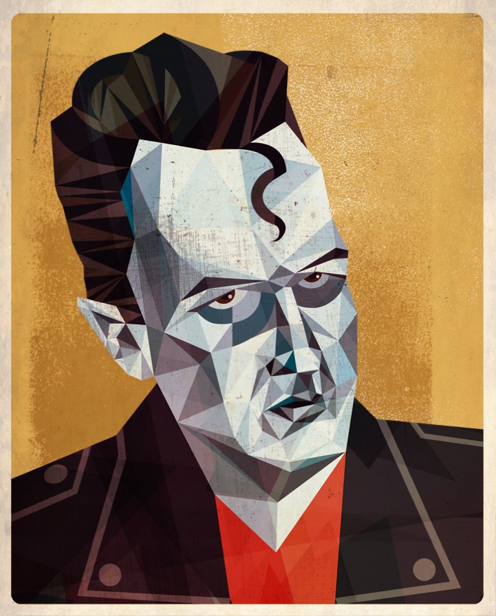
You can see more of this work here. I do think Cubism had a huge impact on the other -isms of this time because it seems to be first of the “rule breakers” that gave way to doing art in a more modern and abstract way. Classically trained artists like Picasso took amazing leaps to break the rules, which in turn made other artists attempt new things as well.
Futurism to Art Deco
Ah yes, so many styles to pick from and so hard to pick just ONE favorite. But after looking through the pictures and different styles I was very pleased with the style of Futurism. I LOVE the movement in the art and all the colors and it seems to evoke a lot of emotion in me. Like with every piece of Futurism I see I feel SOMETHING and I adore that. For art to me means feeling something along with like what you see. The one image I kept looking at when finding photos to use as an example would be this:

Which is Bursting Shell by Christopher Richard Wynne Nevinson
The typical characteristics of the style would include bright colors and violent brush strokes that include shapes close to Cubism but not separating the elements of the subject in the painting. (ie you can tell there’s a building or an animal instead of having everything blurred or altered to the point where you don’t recognize them)
The movement started in the early 20th century in Italy- with corresponding movements happening in Russia and England. It did not include a lot of positive artistic elements in the work.
As compared to work from today’s Graphic Design art I can see some influence of similarities like in fashion and even in the auto industry with car design. But other than that it’s rare to see the style used today.

As we move on to which movement was more influential than any others I would say that each movement had their own way of being influential or even being expressive in their own way but I think the one movement that was the influential would be Art Deco. Made most impressive by the French painter Jean Carlu. To me that was like the beginning of Graphic Design from his posters. I love how simple his posters are and also how he included type with his designs like this image:
I feel like his posters were the most impactful to the audience as they showed the product and the brand name- making people make the connect and having a personal experience with them.
Art Dekko
Art Deco is one of the many art movements we discussed in class that did not end in an “ism”. What caught my attention were the simplicity and cleanliness of the shapes. They artwork, whether it was a poster or architecture, were simple but still very appealing to the eye. It seems like the concept was to “get the idea across”. Based on this logic, you could say that it has carried over into today with artwork such as some posters and logos. The geometric designs or representational forms in products were other characteristics of Art Deco.
On the historic side of things, it originated in the 1920s and then became even more popular in the 1930s specifically under western Europe and the United States. What is notable is that idea that it became popular in the United States seemingly after the Stock Market Crash in 1929. Maybe it was a way to escape the negatives of the times since most of the products that were developed contained materials that were usually more on the expensive side such as plastics and silver.
The main reason why I enjoy Art Deco is the idea that a lot of it is simple, but the artwork is still appealing and gets the message across.
I Don’t Know
The style that I chose to write about is futurism. While looking back at lecture notes on blackboard from class I realized that this was my favorite style even though The London Underground was a very close second option. The one thing that I found interesting was the fact that the Futurist practiced in every medium of art. From painting and sculpture, to film and fashion. When looking through the powerpoint I realized that I picked this subject because of one simple image. This sculpture was created by Umberto Boccioni, and is called Unique Forms of Continuity and Space, “this sculpture depicts the movement of the body and illustrates his theory of dynamism.”
This movement was also very influential to many other movement that we have heard about for example the dada movement in Zunich And Berlin, along with Art Deco, and Surrealism.
London Underground
The London Underground was made up of Cubism-influenced modernists who had trouble finding work. The posters feature influences from futurism, vorticism, and futurism. The purpose of the London Underground was to create more traffic on the Underground during non-peak hours. The posters advertised a variety of things, including destinations in the countryside and within the city. I like this style, because even though they’re all part of the same movement, they all have different looks to them. I also like the different approaches taken to increasing passenger counts. Some posters appealed to shoppers, others appealed to a sense of adventure in the countryside. Frank Pick was the director of the Underground, and commissioned Edward Johnston to create the typeface used on all Underground posters. Johnston’s typeface is still used on all branding for the Underground and is easily recognized as such. This branding unified the various posters created for the Underground, and I think it led the way for more personalized branding for other companies as well. I think the London Underground movement was very important in terms of graphic design history, because all of the posters were made for the purpose of promoting the Underground, but they were also works of art in their own right, which I think is what we as designers strive for.
ART DECO!!!
I used to hate art deco. I thought it was so boring and I just couldn’t stand seeing it. But as I got older I was able to enjoy the simplicity and how much it innovated our culture. Usually the simplicity and how uniform the patterns are really makes it one of my favorite styles. It blows me away how much art deco has influenced the logo’s and designs of today. I feel like without art deco we wouldn’t have the logo’s that everyone knows and loves wouldn’t be what we all know and see. Usually the colors aren’t too vibrant, and then they are they blend perfectly into the piece. Also the repetitive nature and the consistency of the pieces always give the style the signature. You can look at any art deco piece and visualize it as a piece of window art it’s so stunning. Art deco always looks polished, clean and concise. It’s often less about how geometric it looks, but how aesthetically pleasing it can be to see the clean cut and straight lines that makes the patterns look so official and complete. Now if you look at art deco, you see it everywhere. Furniture and architecture now have art deco installed into our every day structures, making art deco itself so noticeable and revolutionary. I really love the style