Dirty Harry poster

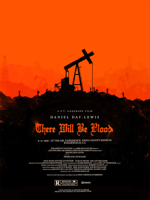
The characteristics that define the International style/Swiss Design was the bold yet simple poster designs. In the poster for the discussion there was a lot of red used in them. I think this style became popular at this time in period because it was during World War II and a few of the poster displayed a little bit of the feeling that was happening at that moment in time. these styles of art are very close to some of the styles we use today. In the discussion it was said that the Helvetica font was used in many of the poster designs. A lot of the designs were geometrical and implied. Dirty Harry poster is one of my favorites from the discussion, simple but complex.  dirty-harry1 there-will-be-blood1


TRIumph

The focus on typography was very needed. I really enjoyed the heavy focus on type that was placed during that time period and the extreme focus on legibility and simplicity. The way that type was looked at was definitely revolutionized. In terms of what can be done, people seriously gathered a greater perspective and began to see type as part of the image rather than something that just transfers information. I think it is amazing how so much emphasis can be placed simply on the words and the way that they are used on a page. The contributions of Swiss Design were game changing. The sans-serif types that were contributed were very instrumental in changing our world today. I mean, the emphasis and stress that was placed around legibility and simplicity was well needed. It affects the way that we make our street signs and pretty much everything today. Magazines, commercials, movies, almost everything tends to use sans-serif type  because of the reasons above. Who knew that their only needed to be simple changes made to letters to make everything run much smoother. This is definitely a lecture where we were allowed to further see the beauty, that is type, and explore how it impacted our world much more than we assume.

The International Style

The Swiss style, also know by as the International Style, gained most of its success through the use of major corporations throughout the US. This style was implemented significantly during the rise of corporate ID.

Corporate ID is the term for the ways in which graphic designers create logos and other elements of design, that better establish a visual theme for the company employing their work. In the late 40’s and 50’s, this style originated heavily from Switzerland which became the basis of graphic design into the 20th century. One of the biggest growths in mediums during this time period was that of typography, most of which was sans-serif based.

With graphic design now being considered a more common profession,  corporations considered their work to be of a more efficient and professional nature. Since typography was booming during this period, it brought on the use of logotypes; which is creating logos with just the use of typography. Logotype is still used to this day, demonstrating its significance of the International Style during these times.

Design wise, this period of works consisted primarily of poster designs created using guides, grids and asymmetrical layouts. These methods tie back to the efficient and professional look corporations were trying to achieve.

The Rise of Corp. ID in Design

Swiss style, which also means International Style, found great success under the patronage of corporations in the US. The International Style was definitely significant in the rise of corporate ID. Corporate ID was a way for graphic designers to create logos and other devices that established a visual theme for a company. In the 40’s and 50’s, this style was created in Switzerland which was the basis of graphic design of the 20th century. One of the biggest growths during this time period was typography. You would find most of the typography was sans-serif based.

With graphic design now considered a profession,  corporations considered this style efficient and professional. It served as a guideline as being a neutral as well. It served objectivity, legibility and above all, simplicity. It was a stripped down form of communication to it’s audience. With typography booming during this period, it brought on the use of logotypes – creating logos with just typography. This is still used to this day, which can tell you it’s significance of the International Style of those times.

Also, there was a lot of poster designs created and they were using guides, grids and asymmetrical layouts. This goes back to the efficient and professional look they were trying to achieve. I think this is one the most significant movements in graphic design history as far as modern design. You can see all these elements still being used to this day.

International Style

Who knew that striping design elements down to basic shapes and colors would be so monumental in the art world. This is exactly what happened when International style flourished and made its way into design. I believe this style became popular at this time for a few reasons. First, after all the chaos after the second world war and the bauhaus, I think artists and other stylish people of the world liked the simplistic and clean look of the international class. People continuously were throwing their emotions in their artwork for decades, where as the international style was completely opposite of that. The international style allowed there work to blend in and provide clarity and function for the user. With the introduction of the international style, this allowed corporate ID to rise in the art industry. This in itself opened up many opportunities for the graphic design industry. Every corporation wanted a design to represent who they were as a business, and this was the perfect job for a graphic designer. Now, thanks to this movement, graphic designers work at home for other businesses to help design and promote their businesses. The international style influenced the art and design world greatly.

Revolution of Type

The revolution of type! It was simple, easy to read, and objectivity. Not to mention it was a combination of photography and type as a form of communication. These are the few characteristics of International Style/ Swiss Design. I believe this style became popular at the time because it was an effective use of type. It conveyed a message in a simple and easy way but also an appealing way.

I believe it was inevitable to happen. We have seen art go through MANY changes in history so it was only a matter of time for the art of type to go through changes and like the different styles of art, this was for the better. In fact I do see this style of graphic design today. As seen below:type

It’s simple and easy to read, not to mention it conveys a message like that of the 1950s.

Swiss Design

The characteristics in the International style and Swiss Design is that they have a lot of reds and black colors in their images that they created. There also were some yellow-ish gold colors incorporated along with red and black. The fonts that they used in some of the images were bolder more noticeable fonts so people could see them better. I think this style became so popular at this time because people hadnt seen stuff like this before so their eyes were attracted towards the bright noticeable colors and bold fonts. The way these were created were very noticeable from across the room so they were easier to be seen. It as inevitable to go with this direction of design because they had limited things when these were created compared to now days. I feel what they made was good for that time period with everything that was going on during it also. Yes I see the style of this influenced in todays style because of some of the color choices and bold fonts that were used to create the images. I feel that these bold fonts and color choices suit things very well depending on the topic they were going for. http://prntscr.com/at51paKgM4dIp

Age of Typeface

The characteristics that defined International Style/ Swiss Design favored simplicity, legibility, and objectivity. I believe this style became so popular at this time because of the movements before. Most styles before this also focused on simplicity seeing the simplest form of an object, which they later infused into typography. Based on the influence and the typography used before this, I do believe that this new and structured style was inevitable. I believe that each style or movement is developed much by the influence of the movement before it. The posters that represent the style of this movements are structuralized, balanced, and what some people would say “clean”. There is a point to everything on the poster, and these posters are used to tell information so it is recognizable legible.

The thing that amazes me is not entire the International Style is not the style itself. What is interesting to me is the influence it has on the designs that follow. It is so structured that the next style rejects the belief of simplicity, objectivity and most importantly legibility. Underneath are some pictures that reflect the International Style/ Swiss Design. And also some picture of what these images influenced later on.Screen Shot 2016-04-09 at 12.47.31 PMScreen Shot 2016-04-09 at 12.39.52 PM

Screen Shot 2016-04-09 at 1.05.35 PMScreen Shot 2016-04-09 at 1.05.57 PM

Swiss Style

The Swiss Style started on switzerland in 1940s and 1950s. It was also called international typographic style and ort international style. This style is characterised by Sans-serif typography,grids,asymmetrical layout and the combination of typography and photography. This style was popular at this time because, of its simplicity, legibility and objectivity. It was inevitable for designers to go in this direction, design for a while had been all over the place and, this was everything they were doing previously, just more simple. Yet it is still appealing to the eye of the viewer. This style is still used today even. It is used in posters, magazines, calendars and even product design.
a1e6bf7e81ac51f833c4b586fc01ff08

c372ee4493f5899ad961b2373f1cc574

Swiss Design

Swiss design was very popular and it became popular very quickly.  Some of the key characteristics of this design where that it focused on simplicity and legibility.  Also this design consisted of sans-serif type.  And they also made asymmetric layouts for things more popular. I think this style became so popular at the time because it was pleasing to look at.  It was made up of very clean lines and the lines everything seemed very orderly and neat.  I also think people liked it because it the style gave a lot of thought into the type and people where really seeing all this effort put into type for the first time.  Which I would think would be interesting to see for the first time.  I do think it was inevitable to end up going to this design.  I mostly feel this was because in a world where words are so much of the information we perceive, it seemed like it was only a matter of time before people really started to focus of it heavily.  Also I think it was inevitable because people where used to looking at things that where pretty similar so the change in design would have been more pleasing and interesting to have around.  I absolutely think swiss design elements are apparent in todays designs and posters.  It is something that was so popular, inventive, and pleasing to look at that it is still used widely today.  Also I think it is still popular because type in todays society is almost more important, if not more important then ever before when trying to convey information.


https://www.pinterest.com/pin/211950726188632607/https://www.pinterest.com/pin/564427765770242188/https://www.pinterest.com/pin/40532465369006916/https://www.pinterest.com/pin/74942781277419108/

Skip to toolbar