The Final Form

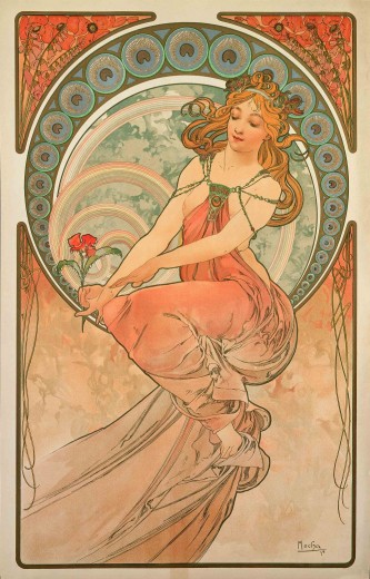
What did I find most interesting of all the art and design that we looked at this semester? Well, I took an Art History course (all the way up to post modernism) and some of the topics that were discussed in this class was similar but not the same. What I really appreciated about Graphic Design Survey, is the fact that it’s all based around the history of graphic design. When we first started this course, it was very interesting to see the beginnings of graphic design and how it’s revolved and shifted from the Gutenberg print press. It was nice to see the periods of general art history (such as the Art Neuvou) and how graphic design was influenced by it.

The most interesting lecture that we had was of course, the psychedelic art. Did it surprise me though? No. I don’t think I was surprised by anything that we learned this semester, to be honest. I’m not condoning heavy drug use, such as LSD but that whole era fascinates me. I really appreciate the style and art of the 60’s and 70’s. No, I don’t like the psychedelic art. It hurts my brain and makes me dizzy. I’m talking about the toned down styles – more like styles of Herbert Bayer (during his US Container days). I like the styles of the Bauhaus. Mid Century. Movies, films, entertainment and music of this era is very interesting to me. This was the time of the avocado appliances. Orange, greens and shag carpet. It’s very ugly but appealing to me.

The manifesto’s were interesting. I think I saw a trend, as most people did tend to focus on their own personal beliefs in the art manifesto, which is what I did. I wanted to share all the things in my posters tried and true statements. Everybody pretty much did a different form, which was pretty interesting as well!


LSD ART

This week was all about the psychedelic artwork. It was the first word that popped into my head when an example of these posters were projected on the screen. It’s exactly what the work was… LSD/Acid tripping artwork. Quite disturbing and very difficult to look at. It has a dizzying effect and I think the post modernists wanted this affect on people. The International Style was already being rejected as early as the 60’s. These artists were creating art that was a self-conscious reaction to the this style.

In California, young crowds hit the music scene and it was drug fueled and wild. These times changed art. It’s when art transitioned quite drastically from the modern art that was quite prominent from decades before. It was a counter culture against social norms – these young people grew tired of their parents strict believes, styles and everything else. It just all went out the door.

Psychedelic artwork was influenced by music. It was a way for audience to get a sense of what they were feeling as if they were on heavy mind altering drugs. They completely took the simple International Style and warped it, as if they were doodling on a piece of paper. It is a direct inevitble response to the Swiss Style because they took things legible and made them completely illegible. These posters were heavily influenced by the style of Art Nouveau as well. I do not like the psychedelic art. I do, however, appreciate this entire movement, with the young audience shifting away from their parents beliefs and starting their own thing. Sometimes a drastic move needs to be done in order to create change.


one two threww

The Rise of Corp. ID in Design

Swiss style, which also means International Style, found great success under the patronage of corporations in the US. The International Style was definitely significant in the rise of corporate ID. Corporate ID was a way for graphic designers to create logos and other devices that established a visual theme for a company. In the 40’s and 50’s, this style was created in Switzerland which was the basis of graphic design of the 20th century. One of the biggest growths during this time period was typography. You would find most of the typography was sans-serif based.

With graphic design now considered a profession,  corporations considered this style efficient and professional. It served as a guideline as being a neutral as well. It served objectivity, legibility and above all, simplicity. It was a stripped down form of communication to it’s audience. With typography booming during this period, it brought on the use of logotypes – creating logos with just typography. This is still used to this day, which can tell you it’s significance of the International Style of those times.

Also, there was a lot of poster designs created and they were using guides, grids and asymmetrical layouts. This goes back to the efficient and professional look they were trying to achieve. I think this is one the most significant movements in graphic design history as far as modern design. You can see all these elements still being used to this day.

Art Deco and the Paterson Building of Flint


The Art Deco movement reflected modern technology, characterized by geometric shapes, smooth lines and bright colors. To me, it’s almost like the Rococo movement. Golds, whites, and very luxurious and sometimes garish. It was a reaction against the austerity imposed by WWI. After the Depression, they used mass produced, industrialized items that catered to the middle class style and tastes. It was very elegant, glamorous and functional at the same time. During the Great Depression, we all know how poverty stricken Americans were. The Art Deco movement pulled us out during those times, offering an escape to those harsh realities.

Pulp magazines was another response to the misery of the Great Depression in the United States. Pulp fiction flourished in the US during this period, offering people an escape through stories of sexuality, mystery and adventure. Pulp magazines were cheap to print using low quality materials. Some magazines featured explicit themes of sexual violence that were quite taboo for mainstream. It worked though, because it was affordable and easily available to mass amounts of people. Pulp magazines turned into a thriving popular culture providing thousands of artists with work. I agree though, that art plays a major role in our culture, especially during tough times.

I was researching Art Deco a little bit further and noticed that we have some of this style here in our very own city of Flint. Check out the Paterson Building – a historic office building located at 653. S. Saginaw St and Third St, downtown. It was built during the birth of the auto industry. The building is very ‘Art Deco’.

paterson2 paterson

Bauhaus Lives On

Bauhaus was an art school in Germany that combined crafts and the fine arts. This movement was influential in modernist architecture and design. They had a respect for materials, art that was hand crafted but yet looked mass produced. It was very non ornamental and minimalist as well. It was founded with the idea of creating a ‘total’ work of art in which all arts including architecture would be brought together. They believed in practicality and utility with modern art. Bauhaus influenced design and education by using teaching methods where a design philosophy was learned. Instead of mastering one specific field in design, designers at Bauhaus are multi-faceted and learned a set of skills. That’s what made their unique approach to education work and was so significant during this time.

bayer

One such artist, whom I admire during this pivotal change in the graphic arts was Herbert Bayer. His artistic skills ranged from graphic design, sculpture, photography, painting, exterior and exterior design, art direction and architect. Bayer became a master at Bauhaus that he eventually taught there. He proved that you can be a multi-faceted designer, which I personally strive to be to this day. I believe the Nazi hated idea of modern art. They labeled the Bauhaus “un-German” and criticized its modernist styles, deliberately generating public controversy over issues like their architectural design (flat roofs). The Nazi government claimed that it was a center of communist intellectualism. With that said, just because they closed the school, it didn’t stop the art from living on to this day.

Collaging a Social Revolution

For this week, we had to discuss  designed used to support social revolution. One of the highlights of this discussion was the Russian constructivism, which of course everyone knows at this point – rejecting the idea of art for arts sake. They did this because they favored art as a practice for social purposes. I would think they were quite effective in making a difference in social change. Artists tried to create art that would take the viewer out of the traditional setting and make them an active viewer of the artwork. One such technique primarily found in this movement is collage. They collage together news photographs and painted sections. Similar to what you would find during the Dada movement, but not quite as destructive. They used bold typography and abstract design with cut-outs of photographs. This is called photo-montage. Photo-montage was used to transform the consciousness of the viewer to a more enlightened state of being. It was a way to disrupt the passive reception of photographs and unleash revolutionary potential of modern images.

books photomontage

(Photos: The use of photo-montage to create social movement).

Do I think designers should play an active role in effecting change in the art world? I would say that depends. I don’t think everyone should be obligated to create artwork for change, but it’s definitely a good trait to have. I’m one of those artists that likes to create emotional artwork that creates an impact on the viewer, but do I want to do it all the time? Probably not. Find a good cause and do something that creates change at least once in your life, in a big way! It’s definitely effective in revolutionary change. Our work has a huge impact, especially with the way social media is today being so instant and readily available to millions of people!

Artists in the current day were for sure influenced by this movement. I particularly like this piece by Banksy. His work connects to viewers, it’s quite moving.

nofut

Cubism, Futurism and…Vorticism? Oh my!

This week, we covered many styles from cubism, futurism to something I’ve never heard of…vorticism. I did not like this style at all. It had a lot of spinning/moving abstract imagery in geometric form. There was some type of pattern treatment with strong lines in the works as well, which I found quite unappealing and a mess. I know that most everyone will agree or write about their favorite style and that is cubism. I have to agree though. That was my favorite style of the night. Cubism had a couple different versions, such as analytical and synthetic. Analytical cubism had sort of a monochromatic, grey and brown aesthetic that tiels to the natural world. I loved the color tones. It’s somewhat muted and sad/depressing. I wouldn’t say I’m a sad person, but I like the natural/textural/browns in this type of treatment. That’s why I chose cubism as the style I liked. For example:

violin_and_pitcher

Violin and Jug (1910) – Georges Braque (1882 – 1963)

Now for the other, synthetic cubism…this has a lot of texture. There’s usage of collages and much brighter colors. This style was probably more significant than analytical. Artists used more mediums, for instances, newspaper might be used as a way to make a collage. It has a flatter, richer quality to it as well…especially in the still life pieces that we viewed. One of the most colorful and vibrant pieces that caught my attention were by artists Robert & Sonia Delaunay. They had strong, bright and bold colors. It had lots of geometric shapes and it was very abstracted, compared to some of the other pieces that you could actually figure out to some degree (you might see a figure, face or movement of a body in a painting in an abstract style but still tell what it was without it being completely abstracted/deformed/distracted).

sonia

Cubism was significant in the history of art and graphic design because when photography came along it shifted the style of painting in a huge way. We started seeing this in terms of modern art in the world of graphic design. What else can paintings do? Artists started bringing out the emotions/feelings through this style, versus a more realistic approach in styles during the previous art movements.

Do I see the influence of this style in today’s graphic design? I would say, yes. I can’t think of an artist who might have been inspired by cubism and uses in in their work today, but I would definitely say they apply these characteristics to their own work in some way. Geometric forms/shapes and abstract art is very modern and timeless. I think this style opened a lot of doors as far as portraying emotion through a painting. When we look at it, it’s more than just colors and blocks. What is the artist trying to say? It’s quite influential.

Propaganda Methods & Differences

Posters were often found in the cities of Europe. They were tightly controlled by the government so that the messages were just as likely to mislead viewers as to enlighten them. So,  during the first World War, there was a huge increase in posters to rally their own citizens to support the war effort. The European powers (specifically Britain) had the smallest army and they had the greatest need for volunteers in the War. That’s when they created literally millions of posters to help eventually recruit over 2.5 million British men to join the war.  This became a big shift in style (halt of the Art Nouveau). These posters displayed a more traditional, natural style for greater appeal to audiences.

One of the biggest methods that were used in these propaganda posters was the use of  emasculation. This is the questioning or weakening of a man’s virility. Which brings me to the well known poster “Daddy – what did you do in the great war?” – this was produced before conscription was introduced in 1916 and aimed to encourage men to join the armed forces through emotional blackmail. It was a method of “Bullying propaganda”.

I think these methods clearly worked well, specifically for Britain (2.5 mil joined war). So something was working. Do I think these methods are still being used today? I would say yes. I feel like young men in high school have these lectures to join the army as a sense of duty and honor of our country. I knew several of my classmates that signed up because they were poor and it would help pay for their education among many other benefits. I see these same propaganda elements used on the website and posters/campaigns (Army).

Propaganda posters used by the Central Powers were different compared to to the Allies.  The allies used a lot more realistic imagery, versus countries like Germany who used a more abstract sense of style. I think the abstract look was misunderstood which wasn’t as successful in recruitment, compared to the British. I believe the cultural differences were probably the reason why they were so different. Germany was somewhat violent/abrasive with their abstract style, while the Central Powers had more of a direct call to war using positive imagery.

 us-propaganda-6-jpg

This is the emasculating propaganda piece that encouraged men to join the war through blackmail. “Be a man and do it” – emasculating much?

ludwig

This piece is more abstracted done by artist Ludwig Hohlwein, which is different compared to the Daddy poster above.

I was driving down the expressway and saw a billboard tonight that made me think of propaganda. Only YOU can prevent wildfires. Do you think this is propaganda? The bear with the pointing finger sure looks like it was inspired by the war posters of the past!

only you

Art Nouveau 2: Simple is Better

Last week, we covered Art Nouveau that was very asymmetrical, nature in form (grassy, floral, vines, butterflies, insects). It was also Japanese inspired as well. This week however, we are covering art in Germany, Austria and Scotland, which is very different. It’s not drastically different, but you can tell they had their own cultural differences. A lot of this art shifted during the industrial revolution and everything was so mundane and mechanical. In Scotland, a little town (Glasgow) had a huge urban growth. I definitely think the artists were influenced by the French, but they made it their own. This time, it’s a little more modern. Take for instance Frances Macdonald, Margaret Macdonald and Herbert MacNair’s pieces (or the Four), compared to last week’s Alphonase Mucha’s. As I was saying last week, you will find Mucha’s work has classical women, Japanese patterns, very romanticized and has nature elements. This week, you can see “The Four’s” poster designs are similar. Their work though is very symmetrical and geometric. It still has the same organic feel but in it’s own separate boxes. Same with the typography, it’s very clean, organized and polished.

thearts mackintosh


So, if I had to pick which week I liked best, I would definitely choose this week’s Art Nouveau. I love geometric forms. Especially the architecture that was covered in this chapter. I prefer the mechanical look of buildings compared to the nature/organic and flow-y lines that they used in architecture. That doesn’t mean I do not like nature though. It just think the aesthetic is visually pleasing. Same with the bold colors, block type and angular lines. I love the restricted and tight look. It’s simpler, more uniform and symmetrical.


Art Nouveau: Mucha Ugliness

Art Nouveau or “New Art” became about during the late 19th century throughout Europe and the United States. This movement advocated nature as their main source of design. You would usually find in this style characteristics such as curved lines and asymmetry, grass, lilies, flowers and vines. Butterflies and insects are sometimes found too. The first style that comes to my mind is of the artist Alphonse Mucha, a Czech Art Nouveau painter. One that I found that was interesting is called “The Arts”. Most of Mucha’s work shows very flowing women that idealized beauty and open sexuality. They wore very neoclassical looking robes and were surrounded by lush flowers. It just screams Art Nouveau, quintessential “New Art” style.  He’s done many paintings, posters, advertisements, and book illustrations as well. Do I like this style? No. I don’t, to be honest. It’s just what I see when I think of this particular art movement. I’ve seen this style a lot, even art students here at Mott have been inspired by the art. I do appreciate that art was brought into this style though, such as the vines and flowers. I believe Mucha’s style was revived in the 60’s with the phsychedelic posters and the like. It’s very retro. I do like the styles from the 60’s and 70’s, which at the time there was a resurgence of that Nouveou style. So maybe that’s why I like it, but don’t? It’s a love/hate relationship. I appreciate but hate it. Odd, I know.

thearts

Skip to toolbar