The focus on typography was very needed. I really enjoyed the heavy focus on type that was placed during that time period and the extreme focus on legibility and simplicity. The way that type was looked at was definitely revolutionized. In terms of what can be done, people seriously gathered a greater perspective and began to see type as part of the image rather than something that just transfers information. I think it is amazing how so much emphasis can be placed simply on the words and the way that they are used on a page. The contributions of Swiss Design were game changing. The sans-serif types that were contributed were very instrumental in changing our world today. I mean, the emphasis and stress that was placed around legibility and simplicity was well needed. It affects the way that we make our street signs and pretty much everything today. Magazines, commercials, movies, almost everything tends to use sans-serif type because of the reasons above. Who knew that their only needed to be simple changes made to letters to make everything run much smoother. This is definitely a lecture where we were allowed to further see the beauty, that is type, and explore how it impacted our world much more than we assume.
Monthly Archives: April 2016
Culture Shocks
The characteristics of Postmodernism cannot so easily be described with simply one specific style. This movement in itself uses characteristics from most of the previous major art movements and styles, along with the incorporation of historical references within the subject matter. Artists at this time also rejected the idea of labeling themselves to only one specific style when asked what they identify their work with. This was a time where artists could try and implement techniques not possible in the past, due to the rapid growth of technology, allowing for more complex processes to be done; mainly in the field of Print-Making. Most of the reoccurring and highlighted characteristics in design from this era relate to the fields of: ornamentation, symbolistic expression and use of visual ‘wit’.
During this era, there were a slew of social events taking place that played major roles in shaping the ‘symbolistic expression’ seen implemented in the artwork. Some major examples of which were: the Vietnam War, the Civil Rights Movement & Protests, and upcoming music events; which was often combined with the use of psychedelic drugs to help the artist establish a vivid sense of color and pattern in their design.
Postmodernism in itself represented a response to the International Swiss Style because it incorporated elements of the past, except improved upon them to ends not previously possible, due to the limitations in technology. Building off elements of the past, while incorporating the characteristics of the current cultural present; Postmodernism proved to be a movement that stands out on its own, through the elements that help define it.

Last one…
If there were any thing i could change about my manifesto it would be the layout and design. If there would have been time in my own schedule I really wanted to try to do a letterpress design in a large poster form. The letterpress project we worked on in class was really interesting to me as well as the lecture and video we went over. Making paper and printing on it for project or even for yourself would be very rewarding in the end. The different textures you can’t get with just printing off the computer. There were so many manifestos I really enjoyed. The amount of time and thought behind some of them were awesome to me.
Although some of the history in the lectures was slightly boring, the history of graphic design is the reason its has evolved into what it is today. All the styles of graphic design eventually come back in some form.
Deco and War
Considering there was a lot of content to cover in the last lecture, I will pick out a few things that stood out to me overall. I really enjoyed the craftsmanship and hard work that was put into making the magazine covers for Bazaar and Vanity Fair. It just seemed like artists around that time had more of a tedious hand in the artwork. Art wasn’t done on a computer. The text, the typefaces, the format, none of it was done on a computer, yet people were very skilled at what they did. Every piece had some type of significance to it and relevance to the time, especially in the vanity fair covers. I specifically like the Vanity Fair cover that had “Uncle Sam” sitting on the planet depressed in the shape of a four. This was very significant, considering that the country was in a depression at that time, so they personified the situation. I can truly see how the graphic design field became more prevalent at that time, and became more instrumental in changing the business world. People became more apt to embracing artistic ideas and visual representation. I also found it interesting how the federal government paid people to create art for them.
The Final Form
What did I find most interesting of all the art and design that we looked at this semester? Well, I took an Art History course (all the way up to post modernism) and some of the topics that were discussed in this class was similar but not the same. What I really appreciated about Graphic Design Survey, is the fact that it’s all based around the history of graphic design. When we first started this course, it was very interesting to see the beginnings of graphic design and how it’s revolved and shifted from the Gutenberg print press. It was nice to see the periods of general art history (such as the Art Neuvou) and how graphic design was influenced by it.
The most interesting lecture that we had was of course, the psychedelic art. Did it surprise me though? No. I don’t think I was surprised by anything that we learned this semester, to be honest. I’m not condoning heavy drug use, such as LSD but that whole era fascinates me. I really appreciate the style and art of the 60’s and 70’s. No, I don’t like the psychedelic art. It hurts my brain and makes me dizzy. I’m talking about the toned down styles – more like styles of Herbert Bayer (during his US Container days). I like the styles of the Bauhaus. Mid Century. Movies, films, entertainment and music of this era is very interesting to me. This was the time of the avocado appliances. Orange, greens and shag carpet. It’s very ugly but appealing to me.
The manifesto’s were interesting. I think I saw a trend, as most people did tend to focus on their own personal beliefs in the art manifesto, which is what I did. I wanted to share all the things in my posters tried and true statements. Everybody pretty much did a different form, which was pretty interesting as well!
The final blog post
This semester I learned a lot about the different art styles. I knew that over the years there have been different types of art and different styles, but I never had really thought about the idea that there have been different art movements. Each art movement displays different styles and has a lot of different characteristics. Some have a lot of ornamentation, others have more simplistic characteristics. There are some movements that have a lot of natural colors, others that use primary colors, and then there are others that use a lot of bright, overwhelming colors. Each movement is so different, and yet you can see inspiration from previous movements.
During class when we looked at everyone else’s manifestos and listened to everyone read theirs, it really showed everyone’s different approach on manifestos and what art is. Some people wrote on what art and design is, some wrote on typography, and others wrote their thoughts on art. Overall, it was really interesting to see the manifestos that my fellow classmates created. Some people did booklets, others did posters, and some people went another route. There were some handmade and others digital, some big, and others made small. Everyone made an interesting manifesto that demonstrates their thoughts and views.
THE END IS NEAR!
One of the things that I have come to realize this semester and it falls under the “suprising me” category, is that graphic design had to start somewhere. It started earlier than I thought it did. Honestly, I hadn’t thought much on it, so I didn’t really realize how early it came to be.
After presenting my manifesto, I realized that I could have practiced my speech a bit more. I also wanted to do something more with my realization, because I feel that a poster just doesn’t do what my message was, justice. Now, when it comes to my classmates manifesto’s, some were more thought out, especially the “details!” one. I loved the colors, and overall design of it. And a lot of my classmates knew what they were talking about (not that I didn’t) but they didn’t seem to hesitate. They were confident in the subject they spoke of. I did notice that some of us had an overall message that design is whatever the speaker thought it was, and some spoke of it being whatever you wanted it to be. I learned a lot this semester, not just in this class, but in the rest of them too. It was a good last semester.
Looking Back on Art 122
Art is all around us and looking back through out history really put in it to perspective. Art can be anything you want it to be, full of color, geometric, grids, manipulative, or sexiest. When seeing all the examples from the past 14 weeks all the art build on each other, each art movement taking things from the previous movement and adding more. Thought out the semester i have always looking at how the typography has changed from each art movement to the next. what really got my attention was The Machine That Made Us (Gutenberg Movie) and the Swiss or commonly know as Intentional style. Nothing really surprised me, it was all informational to me about each art movement.
If I could go back and change my manifesto I would. Cause I still don’t know what a complete understand of what a manifesto should be, but now by the end of the semester I have a general idea of what it should include. At the beginning I would keep my same topic of typography but I think so would change the content so it would fit more of the requirements. Now after hearing all the other manifesto I think I would have now one on the stress the designers face on a normal basic or something along the lines of I am my own worst critic. Among many of the manifesto, each person took what design meant to them and how they viewed design.
THE END.
This semester, I learned how what was going on around artists as well as their personal beliefs about art influenced their designs. For me, this is what my manifesto was about: who I am and how the world around me and my own beliefs have shaped my perspectives on design, its misconceptions, and what it should be. I found the WWII posters to be especially interesting to me this semester because of the tactics they utilized to make onlookers feel what they wanted them to feel. It was surprising to see the lengths they went to in design approaches to get men to enlist in the armed forces. Similarly, I wanted my manifesto to stir something in its readers, to make them look at something in a new light from my point of view.
What might I change about my manifesto? Maybe some of the alignment of the fonts, which was pretty tricky to do in the first place and caused some slight frustration; but overall, I love my design and am proud of the way it impacts you and makes an interesting, original statement, yet references past styles like the International Style. I also was very intrigued by my classmate’s manifesto that talked about conveying the story behind your design. I could really appreciate and relate to her manifesto because who you are really does influence your individual design choices, and people should be able to see that.
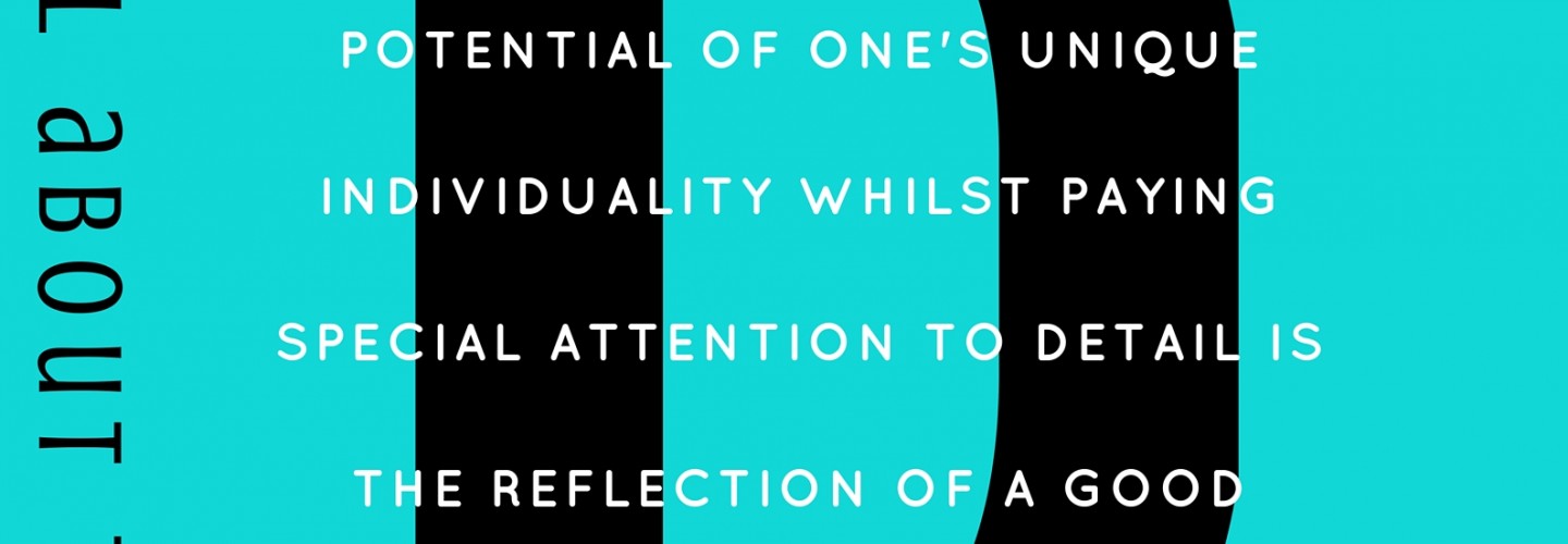
Creativity is essential. It is only made better by attention to detail, never worse, but everyone’s creative choices are different. Everyone has a unique story that can be told best by paying attention to detail so that the design is fully able to make its mark on the world. It’s all about the details.
Semester Wrap Up
One of the biggest things I’ve learned this semester is how much the region plays a role in how a style of art can change and develop over time. I didn’t realize how many art movements there have been either but it makes sense because art has been around for as long as we can remember. Before I had started reading the designers manifestos I had no idea what a manifesto even was. It definitely helped me grasp what a manifesto was I still need to work on how to organize my manifesto. Honestly I found the psychedelic art to be the most interesting now I didn’t say the most enjoying. Reason being is how crazy generally posters were in this time period. The type was all types of crazy along with the imagery. It made me wonder how you were supposed to see these? Were they supposed to be seen while on psychedelics or what are we supposed to see or interpret. Now after I have finished presenting my manifesto in class I wish it would have came out more the way I had envisioned it. I wish I wasn’t so literal in the processes and maybe found a better way to represent my manifesto and what I believe graphic design to be.