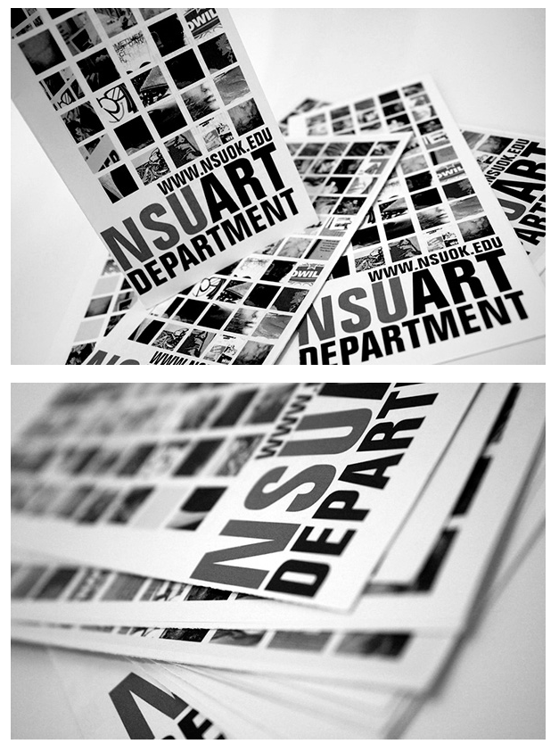
I’m in a unique place of taking an intro class at the end of the program instead of at the start, and I have to admit that I didn’t learn that much new, but it has nothing to do with the course and everything to do with myself having been immersed in art stuff for literally decades now. For me, ART still equals FART. There isn’t anything really I would have done differently about my Manifesto. I’m still not even sure it meets the assignment requirements, and honestly, it doesn’t matter to me because it has been by far the most organic and “me”-inspired piece I’ve created in a very long time. It felt like it used techniques I’ve learned either on my own or in my classes — handwriting fonts, sense of flow, contrast, etc. And it was fun dabbling in the foundation course materials again — chalk, graphite, paint, Sharpies even. It was therapeutic and relaxing, and I am pleased with the outcome. I enjoyed the responses I got, and of all the Manifestos, I was even asked a question and got some laughs, and could see smiling faces, which for me is the whole point of my Manifesto. It was an experience and short journey into my brain that connected with others in a universal way.
Monthly Archives: April 2016
Saxton Campbell: Minimal, fresh, eye-catching
Saxton Campbell is a designer living in NY, NY, who I stumbled on randomly after setting up an account on Behance. I am drawn to him because he seems to have merged design + art + styling + fashion + photography in a minimal, clean, fresh, and eye-catching way that I would love to be able to learn how to do with my own work.

His work seems to be most influenced by the International design movement as it’s very pared down and has clean lines and clean type.

Here is an example of a brochure he worked on that made interesting use of grids and blocky text. Also, I am drawn to the absence of color and yet the design remains visually appealing. His work doesn’t all follow this minimal color usage but he does seem to like monochromatic color schemes. Here is a campaign he worked on to bring breast cancer screening awareness that incorporates his photography and design:


I find photography compelling because it breaks the fourth wall and alludes to breasts in a way that’s abstract and not sexual. The color also isn’t stereotypical pink, but a warm fleshy color that’s really appealing to me. I also like his sense of balance and layering of fonts. You can see more of Saxton’s work here: Saxton Campbell
Synthetic Cubism
Synthetic Cubism was my favorite from this weeks discussion because I enjoy trying to figure out what it is the artist is trying to say or design. There are tons of different textures in the artwork, bright colors, and they are mostly geometrical shapes. The geometrical shapes the artists used are making a object or person you may have to look a little longer at the piece to figure it out and thats what I love about this style. I love art that catches your eye and makes you stare at it a little longer to try and figure out what it is the artist is trying to say or even make. The influence Synthetic Cubism has on today’s graphic design style is with the statues or textures on a corporate identity package.
Dirty Harry poster
The characteristics that define the International style/Swiss Design was the bold yet simple poster designs. In the poster for the discussion there was a lot of red used in them. I think this style became popular at this time in period because it was during World War II and a few of the poster displayed a little bit of the feeling that was happening at that moment in time. these styles of art are very close to some of the styles we use today. In the discussion it was said that the Helvetica font was used in many of the poster designs. A lot of the designs were geometrical and implied. Dirty Harry poster is one of my favorites from the discussion, simple but complex. 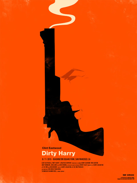
Reaching a Close
I have learned and witnessed many different things this semester in Graphic Design Survey. One of the most important concepts being that of how designs and elements ‘change’ as time passes and humans continue to progress. Changes can occur due to everything from social reform and acknowledgment, to advancements made in technology. Creators today are still using elements of the far past along with new ideas generated from the generations of coming creative individuals. Clashes of new and old, simple and complex, digital and traditional; all complexly forming the creative world of design that we experience every day. From artworks to consumer products, it is undeniable to see the socialistic connections we draw from all of these factors. Design isn’t something that can just be taught straight from writing or some type of equation, but instead is something learned, questioned, and developed through the ways we see each other use it. We learn by example and add our own individualized creative design & thought processes into the mix with it.
This is the greatest concept that I have learned; from class teachings, to the making of my own manifesto. The momentum for future design is dictated by the ability of us as a society to continually share our creative processes with one another.
Is it Over Katie??? Really??? GOOD!!!
During this semester I was able to expand my knowledge and perspective on the art world, as well as find other ways to advance in creating my foundation. Being a part of this class has opened up new ideas and offered new ways to develop my skills. Things that I never would have ever thought about embracing was put to the forefront, and will allow me to go back and reference. One lecture that I was very fond of was the lecture that included Nazi Propaganda and political art. I was very interested in seeing how people were able to affect the minds of the people that they wanted involved in the wars. It was almost as if they were battling through art as well, not just on the battlefield. This lecture gave me a better understanding of the “power” that we as designers possess, and how we can seriously impact everything around us. And though some of the lectures were pretty stale at times, I feel as though it was still needed in expanding my horizons as a designer. I do not regret taking this class, and I do have an appreciation for all of the art that I was exposed to. I understand that it is the foundation that artists stand on today and tomorrow.
DIY and Handlettering
I really respect the call back to Do It Yourself that is going on, in contemporary art. The beauty of having something handcrafted can be lost in translation when someone uses a computer. It feels more personal and more profound when you know that someone got down and dirty with their project, turning it into something that someone else could’ve done on a computer easy. But it’s the effort and energy that was put behind it that makes it so amazing. I feel as though I would definitely want to do some DIY projects in the near future, that will push me out of my comfort zone into doing thing that I never would of thought possible for myself. The hand lettering was just as beautiful. It almost seemed like “Freestyle Typography” if I have to put it that way. I feel as though you could put hand lettering and graffiti together in some ways. Considering they both don’t have to consist of a specific structure and follow a specific format. The video that we watched of the designers doing hand lettering on a cold window displays the “freestyle” nature of hand lettering. No need for stencils, or any guides. Just straight forward lettering, how you believe it should be done.
Into the Digital World
New media such as: web 2.0, interactive design and motion design, have many elements that differ greatly in comparison to more traditional practices like that of print design. Many of the designs made today are done using the aid of a computer; living in an era where we constantly have technology at our fingertips, the need for more computer-aided design will undoubtably grow in demand. This demand leads to a call for more graphic designers; designers to work on things such as: websites, apps and motions graphics that are not only functional but hold the views attention through its ‘creative presence’ and design.
One of the key ways in which New Media differs from more traditional practices is because new media can be found almost anywhere; in this technological age, information can be spread across the web instantly, reaching untold numbers of other individuals. Artists can have their portfolios, full of their work, spread across the web, helping them gain exposure.
One such artist goes by the name of Olly Moss; currently living and working out of Winchester, UK. Here are some examples of Olly’s work, including a link found below that will direct you to his online collection and website.
http://ollymoss.com
Psychedelicadillacar (Ride Along)
In this lecture I believe that it was a huge step away from the simplicity and structure that was found in the Swiss style. There was barely any care given to the type and more to the way that the image made you feel. Saying that you had to be on LSD to understand the poster or read it was hilarious. It was clear proof of how prevalent psychedelic drugs were at the time. So much so that they had to make posters that centered around the drugs. Although, I find it kind of ironic how everything was about rebelling and changing the way that art is viewed but they were still taking things from earlier styles. For example, the art nouveau style very heavily influenced a lot of their styles. Honestly the color palettes that were chosen had to be centered around making people puke. The colors vibrated against each other, and made a visually stressful impact upon the individual that was onlooking. It was beautiful! No one can dispute that the time of psychedelic visuals and the coming of Rolling Stone was instrumental in changing culture. I did not care too much for the post modernism style. The layouts and color choices were not all that amazing and it just seemed like a decline in design.
Psychedelic
Psychedelic posters were the main focus for the postmodernists. The swiss often referred to their style as International Typographic or the International Style. Rock and roll had a huge influence on the postmodernists. They would make make posters for concerts and other events. In the 60s there was a very high influence of drugs and rebellion. That had a huge effect on the art that was being produced. Most of the artist that were creating these poster they were mostly sketching them out while probably on LSD which gave them a different perspective on drawing.
