Web 2.0 is very different from the print design that we were previously learning about. Web 2.0 allows you to see a virtual image in motion and it can be spread around the world 100 times faster than printed design could. It also allows you to be interactive and skip through parts as needed. The thing about this that interests me the most is probably digital portfolios and virtual tours of art museums. Just because with portfolios there are so many possibilities and you have everything in one place for everyone to see. And the virtual tours allow people to see things that they may never get the chance to see in their life all realistically.
Author Archives: nwilson9
Change
Russian Constructivism like to reject the art for art’s sake. They wanted to use art for social purposes. Artist wanted to make the viewer active in viewing the work. I want to say that the movement was successful, because it was still being done to this day. You cans see this in todays artist like Banksy. All of his graffiti art has something to do with a social issue that he wants to bring to the viewers attention. In my opinion I this that designers have a responsibility to play a role in trying to change the world. The work that we do does not always have to be on that issue. We have a skill that can help us communicate with others that words can not and that is important and we should use that to help the cause. If the design conveys the right message it can have a powerful effect it really depends on how it is displayed and which viewer they are trying to reach out to.


Art Nouveau 2.0
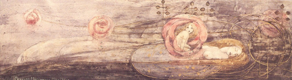
The art nouveau that we learned about last week differs from the art nouveau that we learned about this week. The art we are learning about this week. The Four style is based off of the glasgow style which is a A syncretistic blend of influences celtic revival, the arts and crafts movement and japonisme. They Four are from Scotland and that played an important part influencing their art work. Mostly because it had a celtic feel to it. The key differences between Mucha and The Four is the color and the presentation of the subject matter. In the Four’s version the colors are not as vibrant and more in the celtic form and the figures are elongated. Mucha’s work is vibrant the woman have flowing hair and they represent beauty and sexuality. They both use some type of nature aspect included. Out of the ones we have learned about I think that
i prefer the previous weeks over this weeks, just because they have more color than the others.
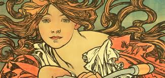
Mucha

This is a piece by Alphonse Mucha he was a czech painter and designer. This image is an illustration of three beautiful woman, this is considered to be an Art Nouveau piece because of the characteristics that it has. The image depicts young beautiful woman who have crazy long and or wind blown hair. Their clothing is also wind blown and sometimes sheer. They also have some form of nature in the images either in the background and or in their hair. The images were a bit risque for the time because of the exposed skin and breast, they represent sexuality and idolized beauty. The Czech style differs from the other countries Art nouveau styles because they favored the earthy vibe. I feel that the country’s culture plays a huge role in the style that the have. Only because of the values and even landscape.
Propaganda
Methods used for propaganda that we had learned about were emasculating messages like to question or weaken a man’s virility to shame men into going, using romance and adventure, telling them it is their patriotic duty, or direct appeal. I believe that some of these messages would still be effective today the only one that I believe would not work as well would be the romance and adventure factor and the shaming, just because of how exposed we are to war due to the media and today everyone sees death and suffering in war not adventure and romance and they have other duties besides going to war. Today they use the patriotic factor telling them be proud fight for your country and they always show how strong and tough they are in the commercials or posters. Our military today mostly uses the perks and money as their main form of propaganda in their posters and ads also.
During the war the allies and central powers had different forms of propaganda. The Allies used pride for the country, patriotism women trying to romanticize the subject as their main focus in the propaganda. They wanted the men to be excited to serve their country. They also used these to enlist nurses and for the purchase of bonds. The central powers tried to evope fear into the people with their posters.


Postmodernism
Postmodernism does not define itself with a specific style. This movement uses bits and pieces from all previous movements and or styles, also they like to incorporate historical references even if they have nothing to do with the subject matter. They do not like to label themselves with one specific style. They would try to do things that were not possible in the past due to the rapid growth in technology. They had interest in ornamentation, symbolism and visual wit. Even though as time progresses the show similarities that put them in the same category. During this time they also had a lot going on in the world which affected their art. They were exposed to the Vietnam War, Civil Rights Protests, and the upcoming music scene. The one thing that always seem to interest me or catch my eye during this period of time is the psychedelics. It blows me away thinking about how they created the vibrant colors in those posters and the hand lettering. It hurts my eyes sometimes, but it is still amazing work.
Postmodernism served as a response to swiss style because they would do things similar to what was done in the past, except improve them to points that were not possible during the time due to the technology growth. I believe that it was meant to be similar to swiss style, just to show off the boost inn technology.

Swiss Style
The Swiss Style started on switzerland in 1940s and 1950s. It was also called international typographic style and ort international style. This style is characterised by Sans-serif typography,grids,asymmetrical layout and the combination of typography and photography. This style was popular at this time because, of its simplicity, legibility and objectivity. It was inevitable for designers to go in this direction, design for a while had been all over the place and, this was everything they were doing previously, just more simple. Yet it is still appealing to the eye of the viewer. This style is still used today even. It is used in posters, magazines, calendars and even product design.

Second World War
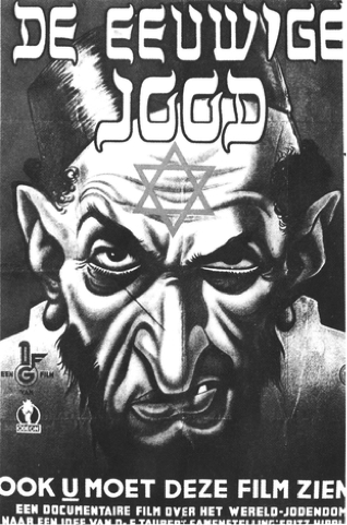
Propaganda had changed during the second world war, it had a more positive effect on the people for the Nazi cause. The Nazi’s were so effective with their use of propaganda, this was mostly because they had centralized control of the press and mass media and the Nazi’s were considered to be the most mass-media aware governments during this time period. They also tried to use the personal interests of the people to convince them to support Hitler and the Nazis. If Hitler and the Nazis would not of been so on top of the mass media they would of been successful but, I believe that the hold on the people would of slowly started to die quicker than it did and the people would of started revolts and created media against Hitler and the Nazi party.
Propaganda in the United States was completely different from the Nazi’s. In all reality they still were used for the same purpose to get people to support the war effort in their favor. United States propaganda was not as dark as the Nazis, they used bright happy moments, things that would tap into the emotions of people and convince them to buy war bonds or woman helping while the men are at war. We used a more sunny side than the Germans did.

Bauhaus
Bauhaus influenced design and design education by combined crafts and the fine arts, and was famous for the approach to design that it publicized and taught. The main goal of this was to create a synthesis of art. craftsmanship, and industry that would satisfy society’s needs, creating mass-market products of high aesthetic value. the students were though theory of color and vision, and the psychology of form they were also trained in various craft. Bauhaus can be seen in work today in furniture design and some architecture. Their unique approach to art education changed the way we teach today, as you advance in your art education you learn each piece individually, color theory, drawing basics etc. The different directors in my opinion definitely changed the work that was being done. Mainly because everyone has different views and ideas. Everyone’s vision is different. The Nazis shut down the Bauhaus during World War 2. I believe they did this because it was a place where people expressed themselves and they didn’t want anyone to oppose the views of Hitler with their art.
Art Deco
Out if all the styles we have studied during class, I enjoyed Art Deco. Mainly because the 20s and 30s are my favorite time periods in the United States and Europe. It also reminds me of my favorite book The Great Gatsby. I like the sophistication in the style and that it was used in buildings, fashion, jewelry, interior design and marketing design. The designs are simple yet they are bold and eye catching with its geometric forms. This style consists of clean shape and often have a “streamlined” look, they look ornament and is geometric or stylized from representational forms the patterns unusually varied and are made from expensive materials. It can be seen on the empire state building inside and out. There are also other buildings still around that share design similarities. I believe that this style is the most significant out of all of the ones that we learned about during this section. This section showed that even in poverty a beautiful elegant design can shine or even bring hope to people. Out of all of the styles this one is the most appealing to the eye and simple. I really with that this style would make a comeback.